
Reviewing Aire: A Whimsical Modern Serif with Effortless Elegance

Hi Everyone
Welcome to another week of FontDiscovery! This week, we are talking about Aire, an elegant modern serif font with many hidden surprises. Read more below. 👇
About Aire
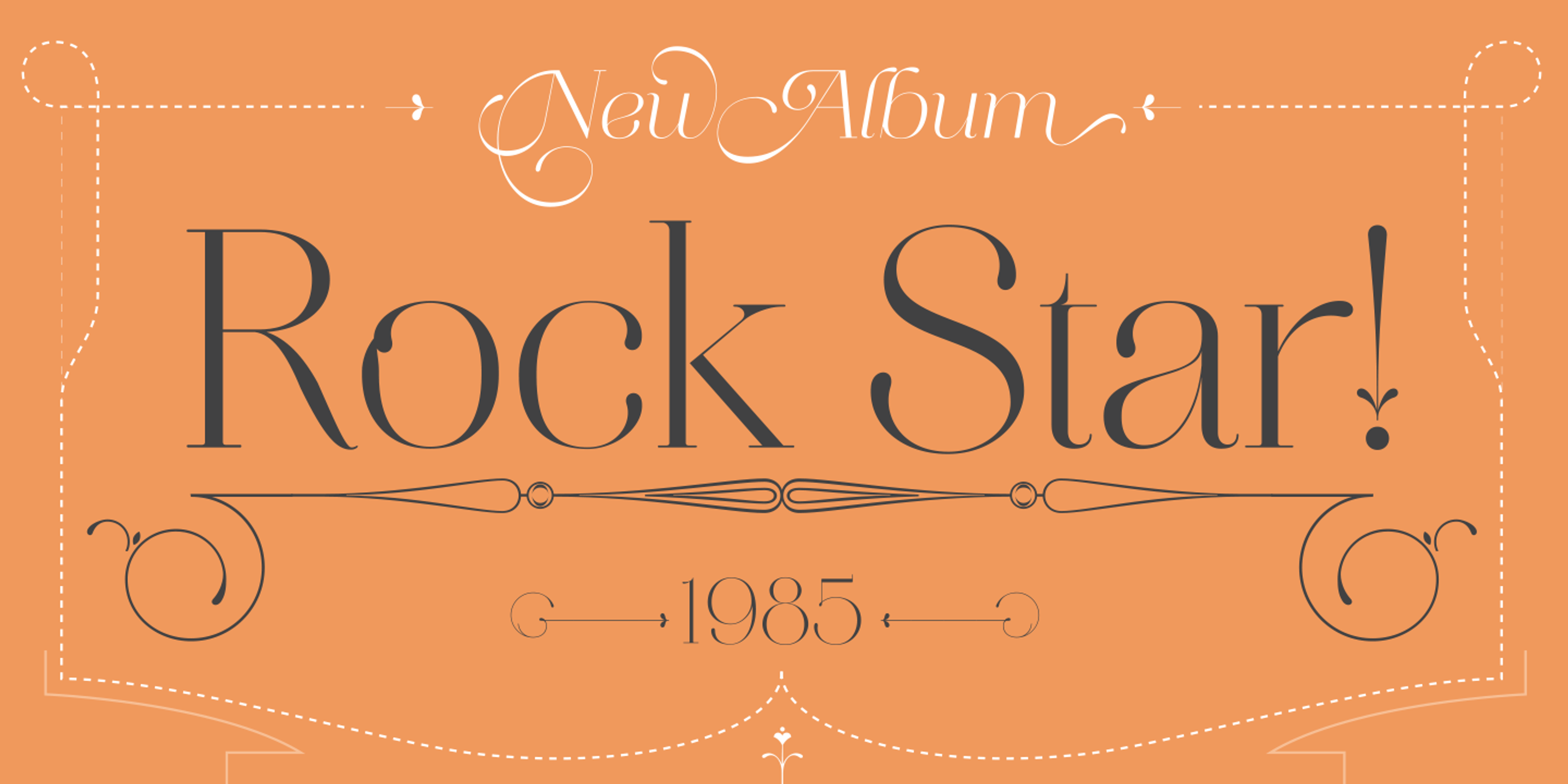
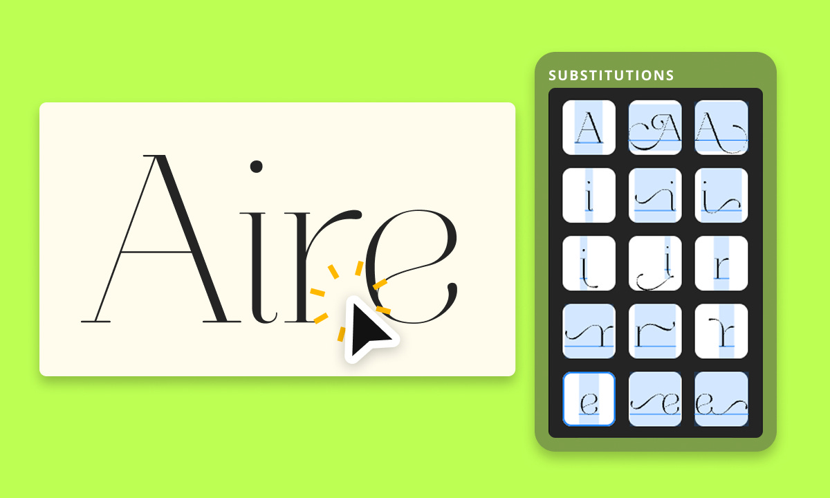
Aire is a delicately sophisticated serif typeface that brings elegance, lightness, whimsy, and a touch of playful charm to display typography. With crisp contrast, sculptural curves, open shapes, and whimsical style alternates, Aire offers a graceful balance of refinement and flourish, perfect for anchoring an entire composition.
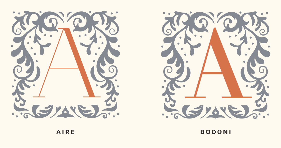
Created by Sproviero Type, Aire is a contemporary take on the modern serif tradition, drawing from the refined elegance of Bodoni while softening its rigidity. It retains the high contrast and sculptural forms of its historical roots but adds a sense of lightness, openness, and playful sophistication. Where Bodoni is formal and austere, Aire is expressive and graceful, bringing a more lyrical touch and a sense of whimsicalness to display typography without losing the timeless beauty of its origins.
Want to use Aire for your project? We are giving it for free inside Typogram Studio!
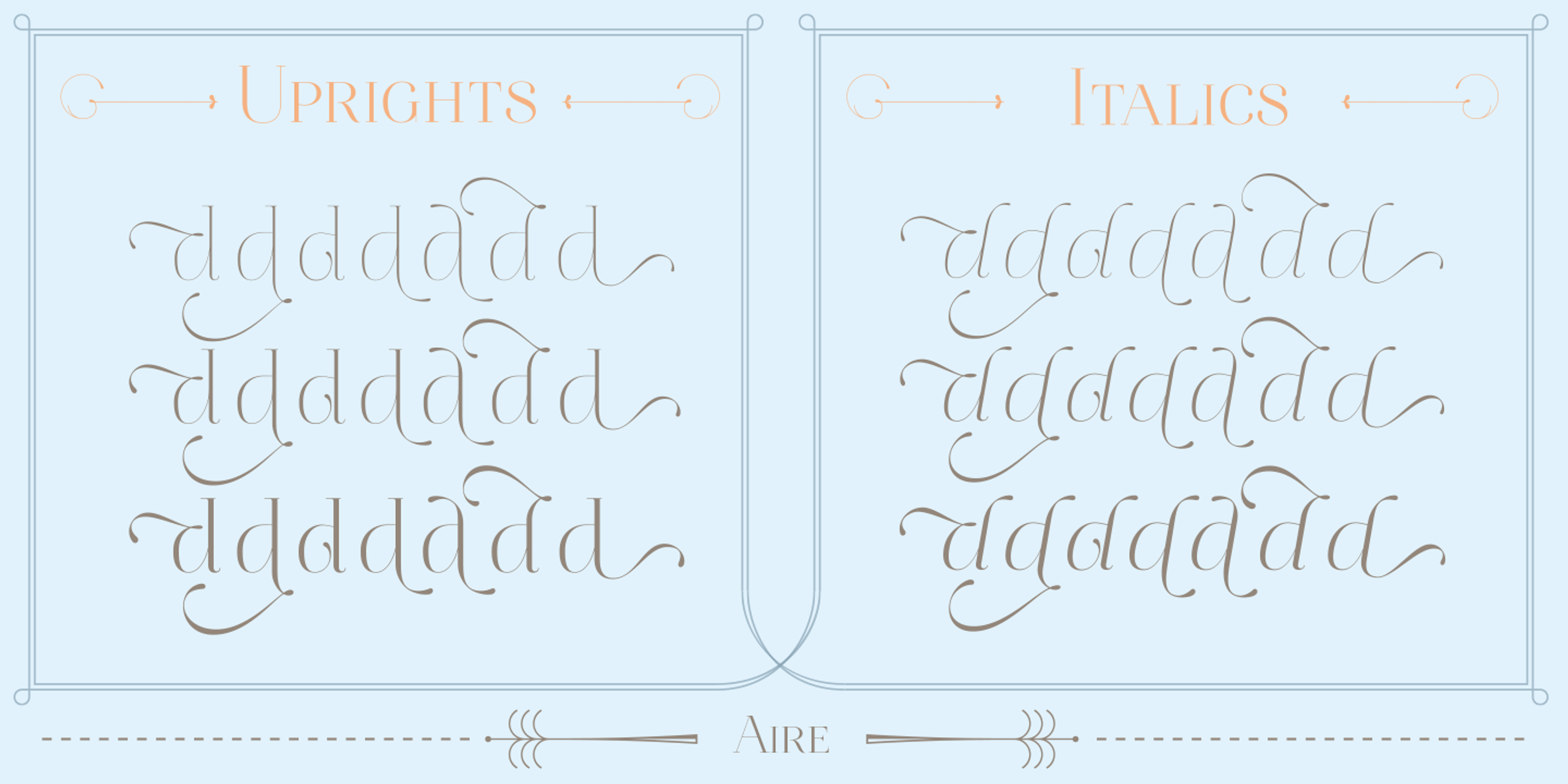
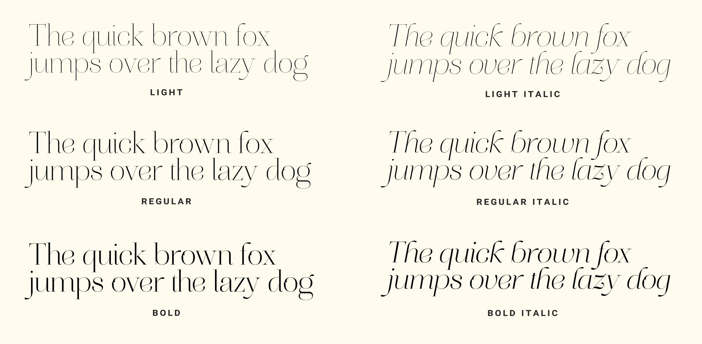
My favorite part about Aire is that it has many whimsical alternate glyphs, perfect for crafting the perfect airy and elegant tone. Aire comes with 3 weights in regular and italic and many beautiful style alternates with crisp strokes to evoke grace and elegance. Whether for dazzling editorial headlines, a sparkling title sequence, or shimmering packaging, Aire is a showstopper.
Aire Type Details
3 weights in regular and italic
Many airy and whimsical ligatures
High contrast with an elegant flair
Using Aire for Design
With its high contrast strokes, sculptural curves, and delicate details, Aire evokes a sense of sophistication while remaining approachable and airy. Its whimsical alternates and charming shape provide the perfect, graceful, and editorial look.
