FontDiscovery 🖼️ 97: A Serif Font Perfect for Online Reading & Writing
Plus: Cool-Color Combinations and Cognitive Bias Directory
Hey Everyone 👋
I hope you are having a wonderful week so far!
This weekend I did a combination of housekeeping for work and chores for the home.
As you know, I have been trying to improve the experience of the FontDiscovery series. One major thing I accomplished this weekend towards that goal is merging FontDiscovery subscribers from non-Substack platforms.
FontDiscovery is published across several platforms, like Revue, and Indiehackers. I finally finished porting the subscribers from Indiehackers and Revue to Substack while I keep working on the FontDisovery archive. Having all my subscribers in one place makes it easy to manage them and keep delivering fresh design and font content. With that said, please feel free to unsubscribe if you no longer wish to receive our updates.
This week, please enjoy one of my favorite issues from the archive!
In This Issue…
Font of the Week: Spectral
Design Idea of the Week: Cognitive Bias Directory
Color Inspiration of the Week: One More Snow
Do you have a friend who could profit from the weekly design tips, just like you do? Please consider forwarding or sharing FontDiscovery with your friend by clicking on the button down below.
Font of the Week
About Spectral
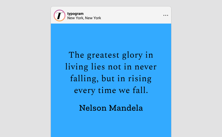
Spectral is one of my favorite serif fonts on Google Fonts. It is calligraphic and natural, and it has a slightly more “brushy” look than the serifs we have featured, like EB Garamond and Comourant Garamond. This modern look results from less stroke contrast, which also makes Spectral more favorable for screen reading.
Font Detail
Nine weights in regular and italic styles
Variable version
Large, triangle-like serifs without bracketing
Specific Usage Tips
How to use Spectral for logo?
Due to less contrast in strokes, Spectral has a human touch and a modern tone. Its visual details around the serif (no bracketing) give it an inviting feel without sacrificing the typical elegance and class that come with serifs. Spectral is perfect for a traditional theme project but appears modernized and updated.
How to use Spectral for marketing and branding?
Spectral is great for text-rich screen-based projects such as blogs and ebooks. It can pair with a Slab serif like Zilla Slab or a sans serif like Noto.
Design Idea of the Week
Cognitive Bias Directory
This week I stumbled upon this Wikipedia page about cognitive bias. This page list 188 Wikipedia pages about cognitive biases, grouped into categories, and rendered as a radial diagram. Each list item also links to their corresponding Wikipedia page.
Color Inspiration
One More Snow
Check out this cool-color color theme for your creative projects!
Lake #33AAFF | Steel #738BA3 | Silver Lining #CED8E5 | Noir #383639
Jargon Buster
Line-Height
The space between two baselines of text.
Want more? check out the jargon buster glossary page.
Creative Prompt
Create something with Spectral!
Thank you
…for reading and hanging out here this week! Spectral is available here.