Hi Everyone 👋
Hope you are having a great summer! Things here are busy at Typogram. Recently, we have integrated the Monotype library and are reworking many core parts of the app to make it even better. Stay tuned, because many exciting updates are coming to Typogram and Typogram Studio!
While testing out new user experiences for Typogram, I have been using a lot of Monotype typefaces. In this post, I want to highlight a recent favorite of mine:
Ogg Family
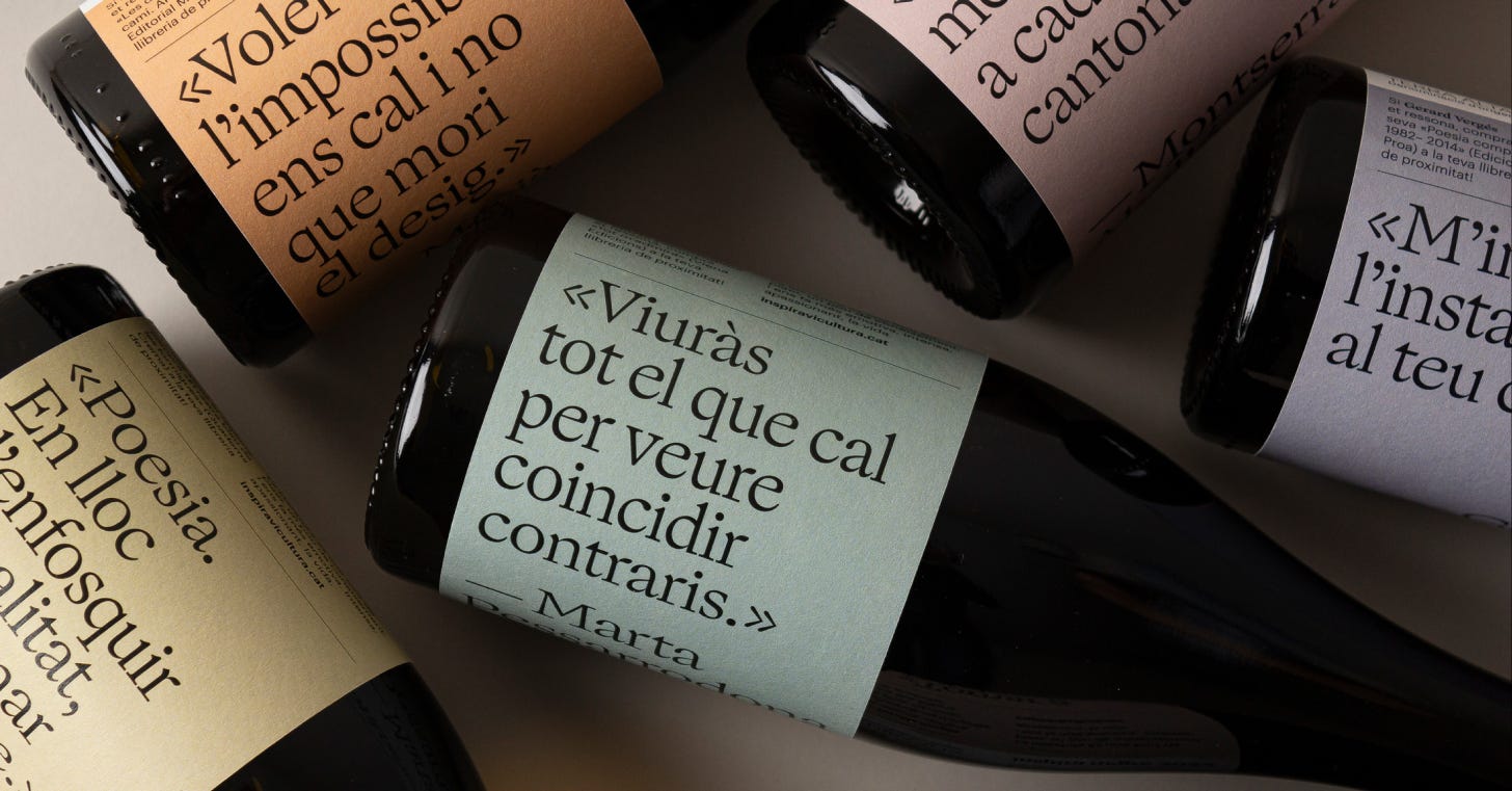
We all search for that one perfect, stand-out editorial typeface with large contrast that looks fresh, modern, and elevated over photography. For me, Ogg Display is that typeface.
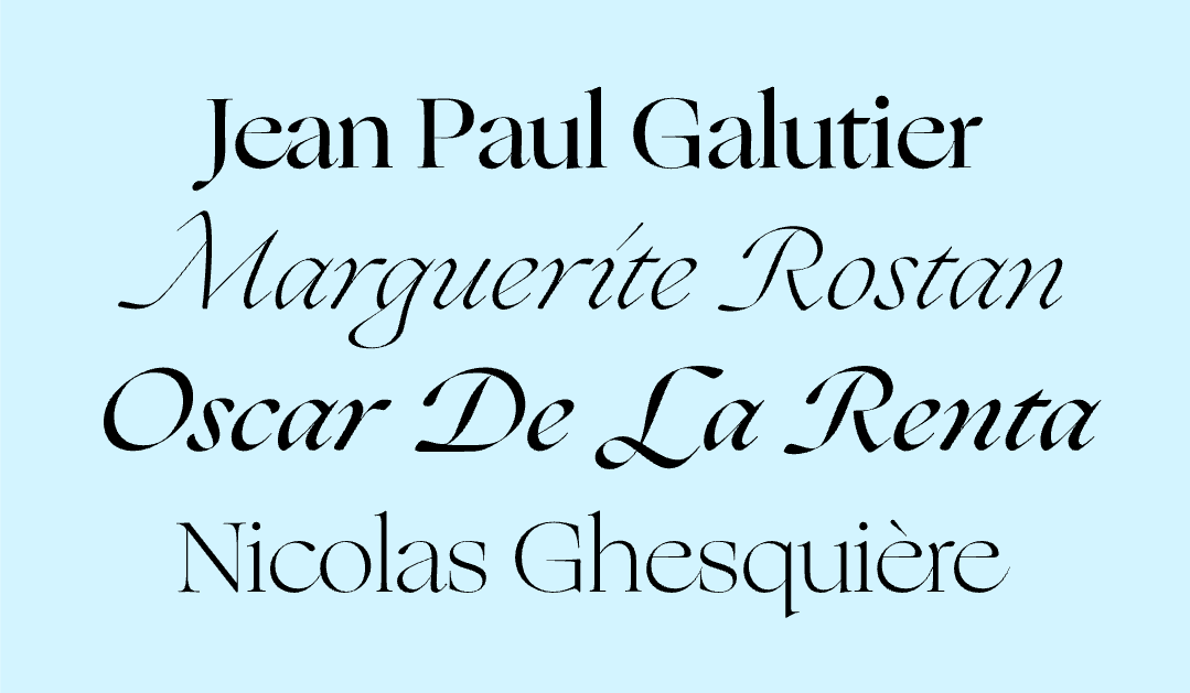
Ogg is a type family that feels as much written as it is designed. It brings together two complementary voices: Ogg Display, drawn by Lucas Sharp with Greg Gazdowicz, and Ogg Text, developed by Sharp alongside Connor Davenport, Wei Huang, and Kia Tasbihgou as its quieter counterpart. Both trace their origins to the hand lettering of book designer and calligrapher Oscar Ogg, and you can feel that lineage immediately. The strokes carry a natural rhythm, as if shaped by hand rather than constructed on a grid.
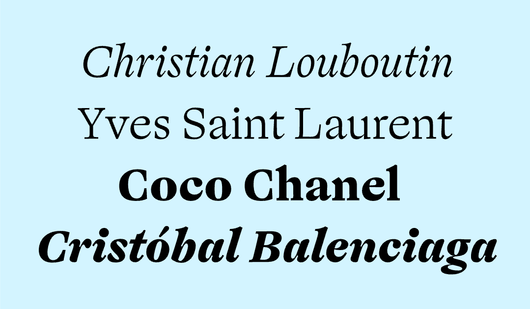
To me, Ogg Display is where that editorial energy comes forward most clearly. With its sharp contrast and expressive forms, it’s made for moments that want to be seen—headlines, covers, identities that need a point of view. There’s a sense of movement in it, a liveliness that keeps it from ever feeling static. Ogg Text, on the other hand, softens that expression into something more measured. It translates the same calligraphic DNA into forms that settle in comfortably over long passages, allowing the personality to remain without interrupting the reading experience. Together, they read like two tones of the same voice: one projecting, one sustaining.
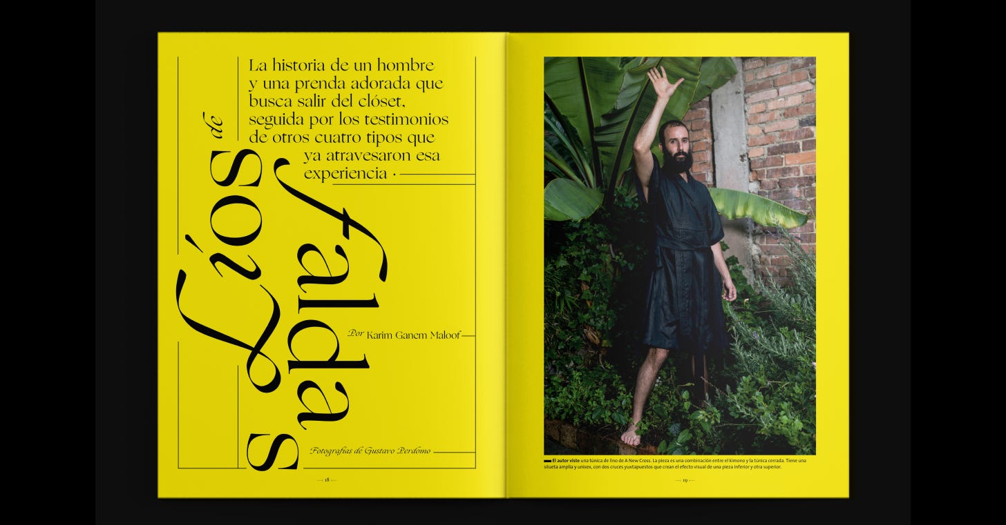
What makes Ogg especially compelling is the craft embedded in its details. The slight irregularities, the tension in its curves, the way contrast is handled: it all resists the kind of mechanical perfection that can make serif families feel distant. Instead, Ogg feels considered, almost intimate. It’s sophisticated without being cold, expressive without losing control. Whether it’s carrying a single line at display size or guiding a reader through paragraphs of text, it holds onto a sense of warmth that makes it linger a little longer.
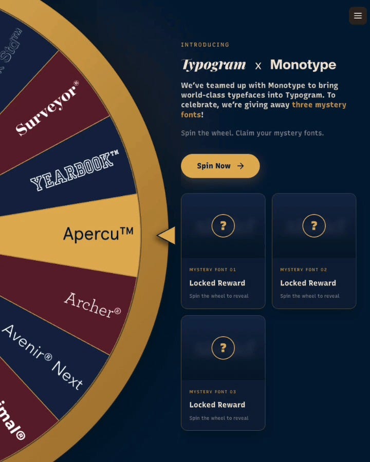
By the way, we’ve teamed up with Monotype on something a bit more playful than usual. For a limited time, you can spin the wheel to unlock a mystery bundle of three typefaces. You can claim these fonts and use them for free for your project inside Typogram Studio. When you are done, export your design as is, or copy directly into a tool you already use : )