
FontDiscovery 🖼️ 180: The Medieval & Renaissance Letter

Hey Everyone 👋
Hope you are having a wonderful week so far. This week, I’m working hard on the launch of Typogram Studio! This is a nice little recording I did recently showing the ligature feature. Also, we now have a playground page. If you are curious, feel free to try it out here: Typogram Studio Playground.
This week, we are nerding on Alemendra, a fantastic script typeface with many influences from the Medieval and Renaissance periods.


Font of the Week
About Almendra
Almendra is a captivating script font blending historical elegance with modern functionality. Inspired by the charms of Chancery and Gothic hands, Almendra embodies the fluidity and grace of these two influential calligraphic styles. Its elegant serif structure strikes a nice balance between tradition and creativity, while its crisp stroke contrast exudes old-world sophistication while remaining fresh and versatile for contemporary designs.

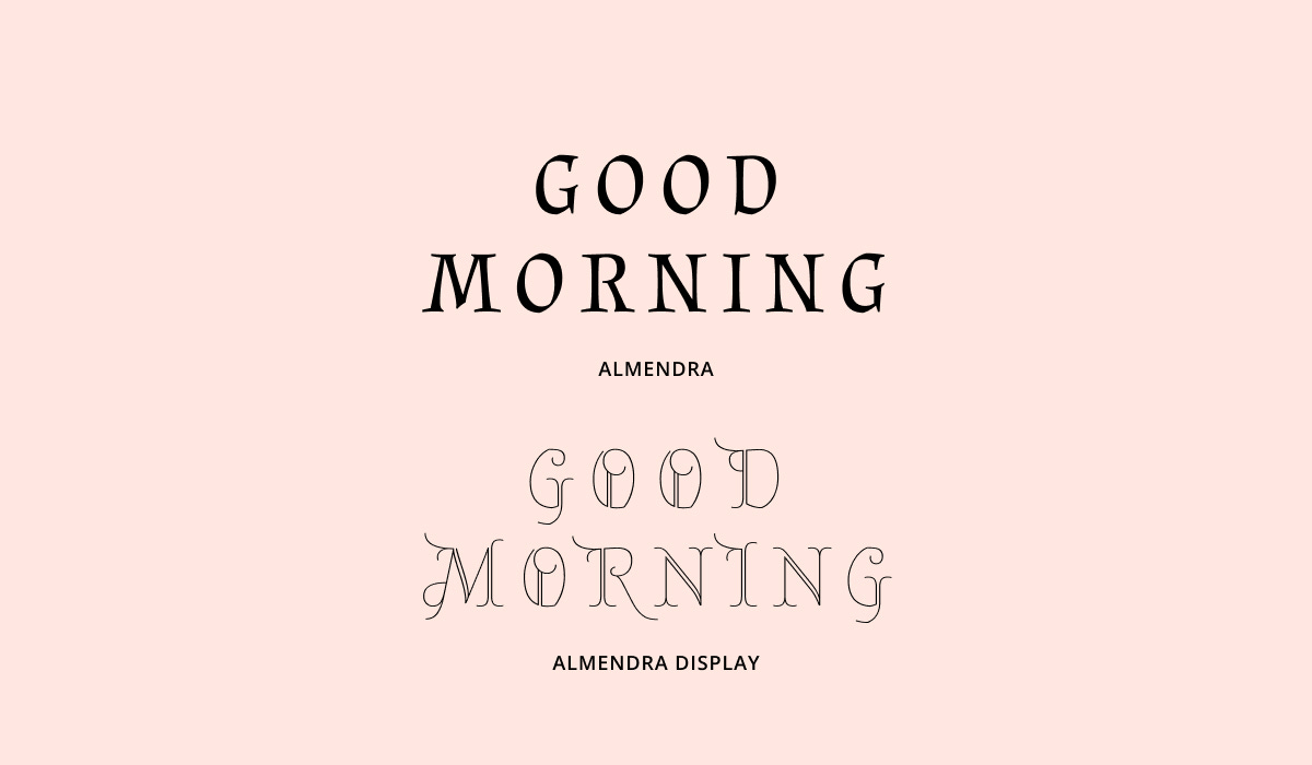
Almendra Type Details
Almendra is designed with generous spacing and a tall x-height, enhancing readability. Its smooth curves and elegant, gothic-informed strokes exude warmth and familiarity, making it an ideal choice for topics like fairytales, magic, and histories(especailly Medieval and Renaissance periods). Additionally, Almendra features a small cap and a display variation (my favorite), making this font family much more versatile for more complex projects.

Almendra Italics
Almendra Italics brings a dynamic flavor to the typeface. The Italics, available in regular and bold, maintain the same character as the regular style but with a sharper flair and a very small right slant. They are perfect for adding an expressive touch to graphics and brand elements.

How to use Almendra for Logo
Almendra evokes a vintage or Gothic storybook feel. The bold weight offers more legibility at smaller scales.
How to use Almendra for Branding & Marketing
Almendra’s timeless style makes it a valuable asset for branding, particularly within publishing, children’s products, and artisanal brands with a historic vibe. Its classic look and readability give it an edge for marketing materials seeking to establish nostalgia and old-timey vibes. We could also combine Almendra with other less ornate typefaces to balance visual harmony to reduce the old-timey vibes of Almendra.
Almendra Font Pairings
Karla: With its straightforward personality, Karla provides a great contrast to Almendra, excellent for branding that requires a mix of sophistication and approachability.

Color Inspiration of the Week
This week, enjoy this beautiful pale pink color palette featuring complementary mint green shade.

Thank You
For another week! Have a fatantstic weekend. See you in the next FontDiscovery.