FontDiscovery 🖼️ 177: One of the First Widely Used Mobile Fonts
Hey Everyone 👋
Hope you are having a great October so far! I hope you are enjoying the fall. Recently, I traveled to Salt Lake City to check out the Brand New design conference! It was wonderful, and gave me so many inspirations!
This week, check out this post on Roboto, one of the first widely used mobile fonts.
In This Post…
What’s New in Branding: Robinhood
Font of the Week: Roboto
Color Palette of the Week: Fall - Sunset
Know a friend who might enjoy weekly design inspirations?
Font of the Week
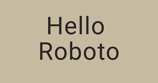
All About Roboto
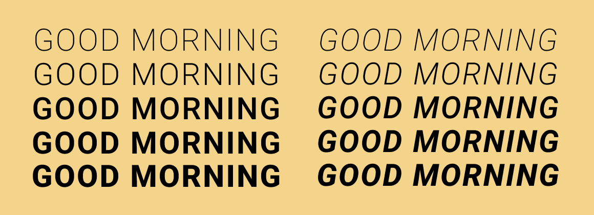
Roboto is a typeface known for its mechanical precision and modern, geometric structure. Initially created for Android, it balances geometric shapes with open curves, providing both clarity and legibility. Its tall x-height ensures excellent readability across devices and sizes, making it a popular choice for digital products and mobile apps. Despite its precise design, Roboto features slightly rounded details, giving it a friendly and approachable feel, perfectly blending modernity with versatility for seamless use on screens.
Font Details
High Legibility: The font’s tall x-height ensures excellent readability across different devices.
Neutral Yet Friendly: Roboto’s oval shapes give it a friendly, approachable vibe.
Modern and Geometric: Roboto has a modern, geometric structure in its letterforms.
How to Use Roboto Font for Logo
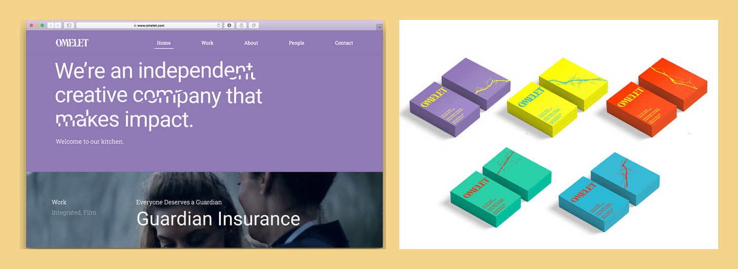
Roboto is a modern, geometric font with clean lines, making it perfect for tech companies or minimalist logos. Its balanced letterforms create a sense of reliability and professionalism, so it works well for brands that emphasize clarity and precision. Pair it with simple graphics or icons for a sleek, contemporary look.
How to Use Roboto Font for Branding & Marketing
Roboto's clean and modern appearance makes it an excellent choice for marketing and branding, particularly for digital platforms. Its readability and neutrality give it wide appeal, allowing it to effectively communicate professionalism and innovation across various media, including websites, apps, and advertisements.
Roboto Font Pairings
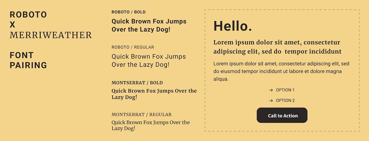
Roboto + Merriweather
Roboto + Open Sans
Roboto + Lora
What’s New in Branding
Robinhood’s New Brand Identity
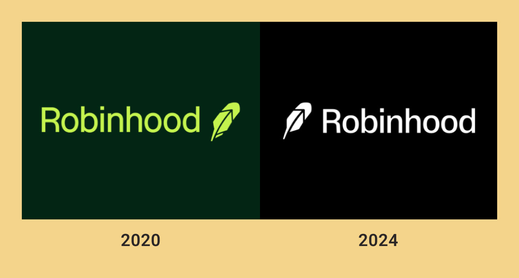
Robinhood’s new branding was introduced with a refined logo, modular layout, and a black-and-white color palette with bright neon green accents, emphasizing control and simplicity. The old branding focused heavily on bright green tones and youthful, disruptive visuals, emphasizing accessibility. The new branding shifts toward a more refined aesthetic with a modular design system and a sleek black-and-white palette, punctuated by neon green accents. This branding evolution reflects Robinhood’s growth into a mature financial platform, balancing sophistication with approachability, compared to its earlier, more casual identity focused solely on democratizing stock trading.

