FontDiscovery 🖼️ 175: Typography, Silent Voice of Society
Hey Everyone👋
Hope you had a great week!
Recently, the Olympics and the Paralympics wrapped up. Here is our write-up on the design of the Paris Olympics branding. 👇
Hello, I hope this newsletter finds you well! How has your week been? As for me, I've been diving deep into the visual branding of the Paris Olympics 2024, and let me tell you, it’s been quite a brand study!
Paris 2024: A Visual Symphony
Our Second Episode: Paris Olympics’ Curve of Victory — Unraveling the Iconic Brand Design of the 2024 Games.
In our latest episode of “Typography - The Silent Voice of Society,” we explore the fascinating world of the Paris Olympics 2024 branding. It’s a perfect example of how typography and visual design come together to create a powerful identity.
Did you know there’s a single visual element that represents the entire Paris 2024 games? It’s not the purple stadium or the iconic medal - it’s something far more subtle and clever. I’ll give you a hint: it’s all about the curves!
The Duality of Design: A Demure Masterpiece
The core of the Paris Olympics branding is an iconic logo that's both a woman's face and the Olympic flame. Created by the talented team at Royalty Eco-Branding, this emblem is brilliantly subtle - or should we say, demure?
“Demure” has become a trendy word that everyone’s using on the internet lately; typically meaning modest or reserved. The design is demure in that it’s brilliant but understated, conveying its message without shouting.
Here’s what the creators say about it:
“The emblem carries several symbols: the face of a woman as an allegory of freedom, the Olympic flame as a symbol of progress for all, and the gold representing human excellence.”
The duality of the logo is clever - if you remove the lip, it looks more like the Olympic flame, but add it back, and it's unmistakably a French woman’s face. It’s a testament to the power of thoughtful design.
Curves: The Visual Thread
What truly sets the Paris 2024 branding apart is its clever use of curves. This design element ripples through every aspect of the visual identity, from the logo to the typography. The wordmark “PARIS 2024” eschews traditional straight lines, opting instead for subtle curves that echo the circular motif of the main emblem. Even the tiniest details, like the separation between the dot and stem of the ‘i,’ feature a curved gutter rather than a straight one.
Bezier Curves and Brand Identity
For all you fellow design nerds out there, I took a deep dive into the Bezier curves of this logo. Using the Bezier Curve editor in Typogram, I discovered some fascinating details about how the designers used extrema points to create a perfectly balanced icon.
A Stroke of Genius: The Zero Becomes an Icon
Perhaps the most ingenious aspect of the logo’s versatility is how it transforms for different formats. When a longer, rectangular shape is needed, the designers cleverly replace the “0” in “2024” with the main emblem. This solution not only maintains brand consistency but also allows the iconic face/flame symbol to be present even in space-constrained applications.

The Devil in the Details
While the overall concept and execution of the Paris 2024 logo are undoubtedly strong, a closer inspection reveals some imperfections in the Bezier curve construction for the wordmark. Unlike the main emblem, which adheres to proper “extrema” placement of anchor points, the curves in the wordmark appear somewhat random. This subtle flaw might go unnoticed by most, but it stands as a reminder that even in world-class design, there’s always room for improvement.
Beyond the Logo: Branding a Stadium
But the branding doesn’t stop at the logo. The Paris Olympics team had to think about how to brand an entire stadium! They came up with a brilliant solution: the brand color purple. From the track and field to the athletes’ towels, this distinctive hue creates a cohesive brand image across all aspects of the games.
The Olympic Brand Family
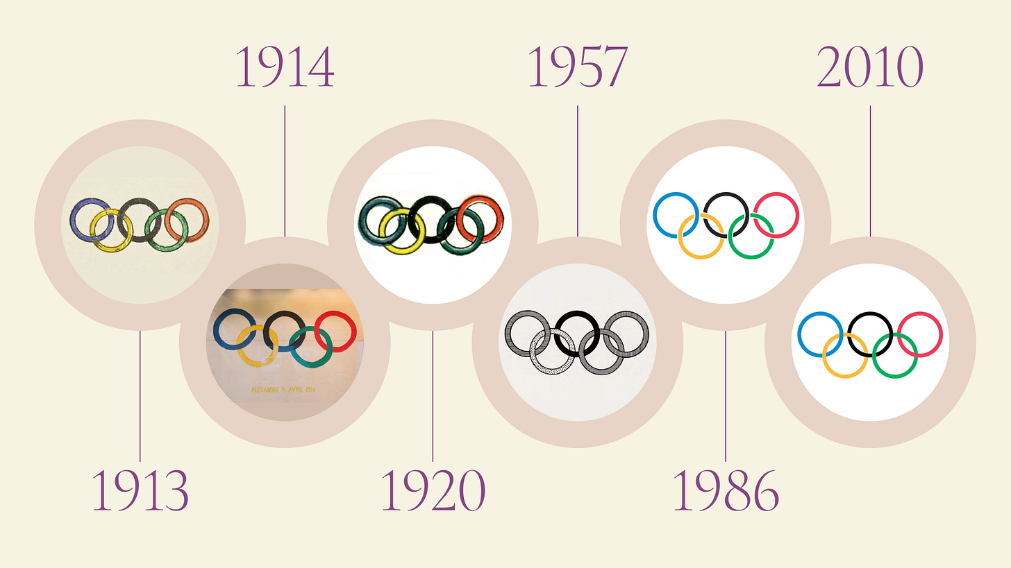
While the Paris 2024 logo captures our immediate attention, it’s worth noting that it sits under a larger umbrella - the overarching Olympic brand. Central to this brand is the iconic Olympic rings symbol, which has a fascinating history of its own.
The Olympic rings have undergone several iterations throughout their history. There have been a total of six versions of this symbol since its inception. The most recent significant change to the Olympic rings occurred relatively recently. The version used up until the 2008 Beijing Olympics featured a distinct design element: the rings had small gaps where they intersected, suggesting a spatial relationship between them.
Join Me on This Journey!
You can find this episode and future installments on the Typogram YouTube channel. I’d be thrilled if you’d subscribe and join me on this typographic adventure!
I’m eager to hear your thoughts on the Paris 2024 branding. What aspects of it stand out to you? What other Olympic brandings would you like to see analyzed?
P.S. Don’t forget to check out the video and subscribe to the channel. Your engagement is the best motivation to keep these typography conversations going!


