FontDiscovery 🖼️ 159: An Fantastic Font for All Your Expressive Graphics
Plus: Colors from Pura Bratan and Design Ideas from Art Nouveau
Hey Everyone 👋
Hope you had a great so far. Last week, I finally finished my naming course! Now, they live inside our email automation system, and I'm so happy.
While working on this course, I suffered from writer's block, so I took some time and stepped away from social media - It helped me with deep work, though I couldn't help but feel guilty that I didn't share as much about Typogram as usual on Twitter.
My big goal for this year is to plan better. I'm still working on creating a better system for creating, sharing, and distributing content. If you've got a good strategy, reply and let me know!
This week, check out one of my favorite creative, expressive fonts from the archive, Lithops. Next week, we will have a brand new issue of FontDiscovery!
In This Issue…
How to Use Lithops for Logo, Branding & More
Font of the Week: Lithops
Design idea: Art Nouveau
Color Inspiration: Pura Bratan
About Lithops
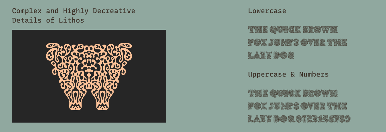
Today we share Lithops, a crazy visual font with beautiful painterly details. I was so impressed with all the visual details in Litho, I had to research its creation and inspirations. Though it looks highly hand drawn, Litho was initially made on Procreate (the iPad design app) with a diverse mix of inspirations, ranging from art and science: Art Nouveau, Alzheimer's brains, and Matisse cutouts. All of these resulted in a highly complex font with incredible eye-catching visual details, more friendly to large display sizes.
Font Detail
Uppercase only
Incredibly visual and highly decorative
One weight
Specific Usage Tips
How to use Lithops for logos?
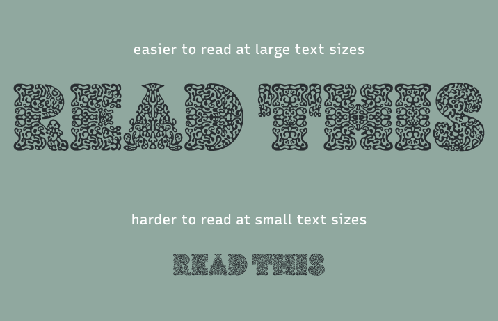
Though Lithops has beautiful details, it is hard to read in small sizes. The letters lose some of their details and sometimes the complex decorative texture becomes distracting for readability. It is meant to use in display sizes only.
How to use Lithops for Marketing?
As website headers, it is hard to read. But its amazing visual details make it a great candidate for marketing graphics and adding an eye-catching flair to hero images, and landing pages.
Design Idea of the Week
Art Nouveau
We mentioned Art Nouveau as an influence on this week’s font. Well, what is Art Nouveau?
Art Nouveau is an international style of art, architecture, applied art, and especially decorative arts. Art Nouveau is inspired by natural forms like plans, and flowers as well as movements, and is often expressed visually in whiplash lines.
Color Idea of the Week
Colors from Pura Bratan
This week, enjoy this beautiful palette of Pura Bratan, in Bali, Indonesia.
Jargon Buster!
Font Family
Font Family is several fonts sharing a broader design characteristic. Each font within the same family can differ in font-weight, the thickness of the characters, font style, such as being normal or slanted, font width, the width of letterforms being condensed or extended, and more. In CSS (code provides visual styles to web pages), font-family defines the font applied to a selected HTML (code giving structure and content to web pages)element for the web page.
Check out more Jargon Busters!
Creative Prompt
Create a social media post with Lithops!
You Made It!
Lithops is available to download here.


