FontDiscovery 🖼️ 130: A Terrific 3D Visual Font for Marketing Design
Plus: Typogram featured in No Code Success Newsletter!
Hey Everyone!
Hope you are having a fantastic week so far! Last week, Typogram was featured in No Code Success Newsletter, where I talked about how we developed our logo design tool. Apologies that newsletter is a little late. This week, I am mostly working on writing new materials, and trying to brainstorm new ideas to grow Typogram.
This week, enjoy the font Tilt, an extremely visual font from our archive!
In This Issue…
Font of the Week: Tilt Prism
Design idea: What is Variable Font?
Color Inspiration: Catskill, New York
Font of the Week
About Tilt Prism
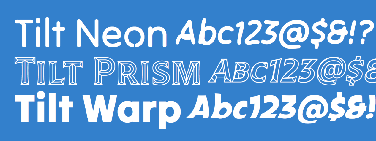
Tilt is an incredibly visual family of fonts. Tilt is inspired by the urban landscape, especially the protruding, three-dimensional lettering in storefront signages.
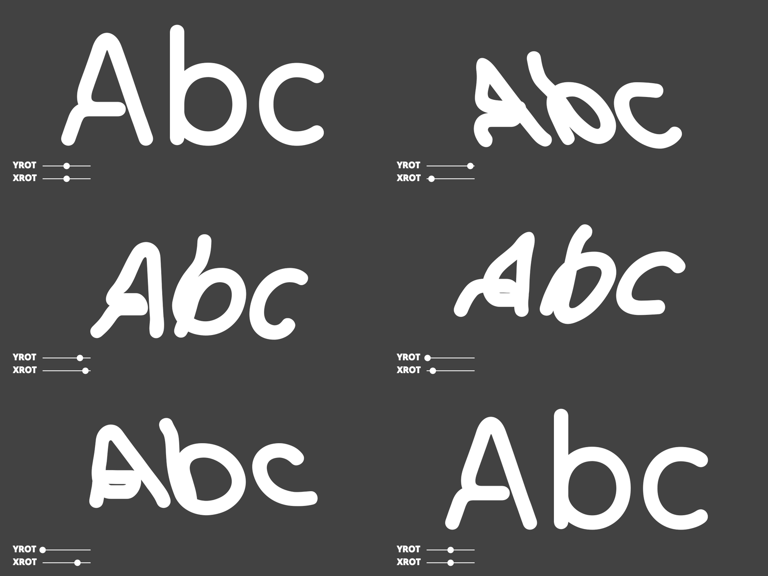
There are three fonts, all variable, in the Tilt font family collection: Tilt Neon, Tilt Prism, and Tile Warp. The structure, or backbone of the font, is built from a geometric sans serif, and each font brings a different style and usage. Of the three, Tilt Prism is the most graphic and perfect for eye-catching marketing graphics and landing pages. My favorite part is the ability to manipulate this font’s rotation in the x and y directions through its variable axes.

Font Details
Variation axes to manipulate the font visually
Outline details, creating a fantastic 3D prism effect
Capitals only

How to use Tilt for marketing and branding?
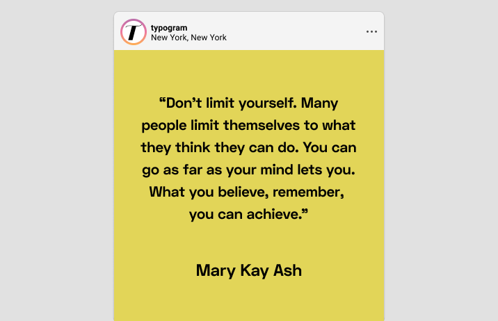
Tilt Prism is perfect to use as display sizes for landing pages. The visual details (the best part) of Tilt Prism are most eye-catching when it is displayed at large sizes on landing pages and graphics. Tilt can be paired with sans-serif typefaces like Space Grotesk and serif fonts like Spectral.
Design of the Week
What is a able Font?
A variable font is a new font technology allowing a font to “generate” infinite weights and styles based on predefined parameters by its designers.
Usually, if you select a font, you will often have limited weights, such as “regular” and “bold.” But with variable font, you can have infinite weight choices because you can get weights between regular and bold. This interpolation also works for font styles because sometimes, font designers create special style axes for a font, as in the case of Tilt Prism, with axes for x-rotation and y-rotation.
Typically, variable fonts come with traditional static versions, making them more compatible with most design apps. These static versions are more than enough for many cool projects. Nevertheless, if you use the variable font version of this font, you can customize the parameters for each axis in CSS to create your unique flavor of the font for your designs.

Color Inspiration of the Week
Catskill, New York
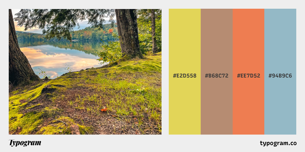
This week, enjoy colors from Catskill Mountain, New York!
Typography Jargon Buster!
Ascender
An ascender is a vertical stroke of a lowercase letter extending upwards, beyond the x-height, sometimes beyond the cap height. For example, “h” is a lowercase letter with an ascender. In general, typefaces having long ascenders and descenders help with readability. Long ascenders help make a lowercase more distinguishable as long as the other parts of the letters are legible.
Want more typography jargon buster? Check out this post!
Creative Prompt
Create something with Tilt Prism.
Thank you
…for reading and hanging out here this week! Tilt Prism is available here.


