FontDiscovery 🖼️ 116: The Perfect Display Font for Spring
Hi Everyone 👋
Hope you had a wonderful weekend!
This week my co-founder and I are working intensely on our grand launch for Typogram later this month. I can't wait to share more details soon.
Meanwhile, I am seeking ways to get the word out about Typogram. If you have a podcast, newsletter, youtube channel, or blog, or are part of an entrepreneurship community on Facebook, slack... any platform, I would love to collaborate. Just reply to this email, and we can take it from there. 🌻🙏
Since spring is here, I thought it's a great opportunity to re-feature Red Rose, a great display font for marketing.
In This Issue…
Font of the Week: Red Rose
Design Idea of the Week: Animation Templates
Color Inspiration: Fall, Update New York
Do you have a friend who could profit from the weekly design tips, just like you do? Please consider forwarding or sharing FontDiscovery with your friend by clicking on the button down below.
Font of the Week
Smelling the Red Rose
If you are looking for something that looks like it belongs in a storybook, look no further. Red Rose is here.
What stands out about Red Rose is the tiny serifs at the end of its letters. Bracketing is the curved connection that connects serifs to the stems of the letters. When a letter has more “bracketing,” it generally has a softer and warmer tone due to the lack of sharp angles. In Red Rose, the letters mimic the shape of a rose, with the organic strokes, tiny serifs, and large bracketing. Visually, this looks like thorns at the stem.
Red Rose was originally designed for a poster series about love, passion, and noir genres. The organic letterform and the wide letter width remind us of fonts used for fairytales and storybooks with a sense of wonder and mystery.
Font Detail
Quirky curve tail on Q, and y
Tiny serifs
How to use it for logo?
With its small serifs and lack of contrast, this font can be great for logo for companies that want to look inviting, organic, classic, and a little quirky.
How to use it for marketing?
Rose Red is great for headers or pull-out quotes. It has no italics and comes in Light, Regular and bold weights. It looks great as a display typeface for headers and large size marketing copy. It could pair with Roberto or a classic serif, like Cormorant for the body text font.
Design Idea of the Week
Templated Animation
I was recently having a conversation with a Youtuber about adobe after effects (adobe’s animation/ video effect creation software for video) and they mentioned how difficult it is to create the perfect animation from scratch. When I told them you could speed up this process with animation templates, they were ecstatic! Here are the resources I shared if anyone is making videos:
EnvatoElements
There are many great free animation templates here. I like that they organize the templates by logos, openers, product promos, and more, so you can quickly filter down what you need.
Mixkit
This website includes free templates for animations in various file formats and stock footage for videos, as well as many other free assets, like music, which is handy for podcasting.
Color Idea of the Week
Update New York
This week, check out the beautiful trees in in upstate New York!

Typography Jargon Buster
Neo-Grotesque
seen around 1950s
Neo-Grotesque reworked the design of Grotesque and made shapes and curves of letters less awkward. Roboto is an example of Neo-Grotesque.
Want more typography jargon buster? Check out this post!
Creative Prompt
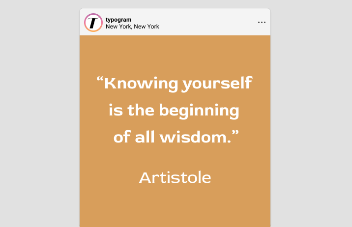
Try creating a social media graphic with Red Rose!
Thank you!
Thanks for being hanging out here this week. Red Rose is available here. It is designed by Jaikishan Patel.