FontDiscovery 🖼️ 107: Our Product Announcement and a Versatile Reading Font
Typogram is available for you to try!
Hey Everyone 👋
I hope you had a lovely weekend. Apologies that I'm a little late today.
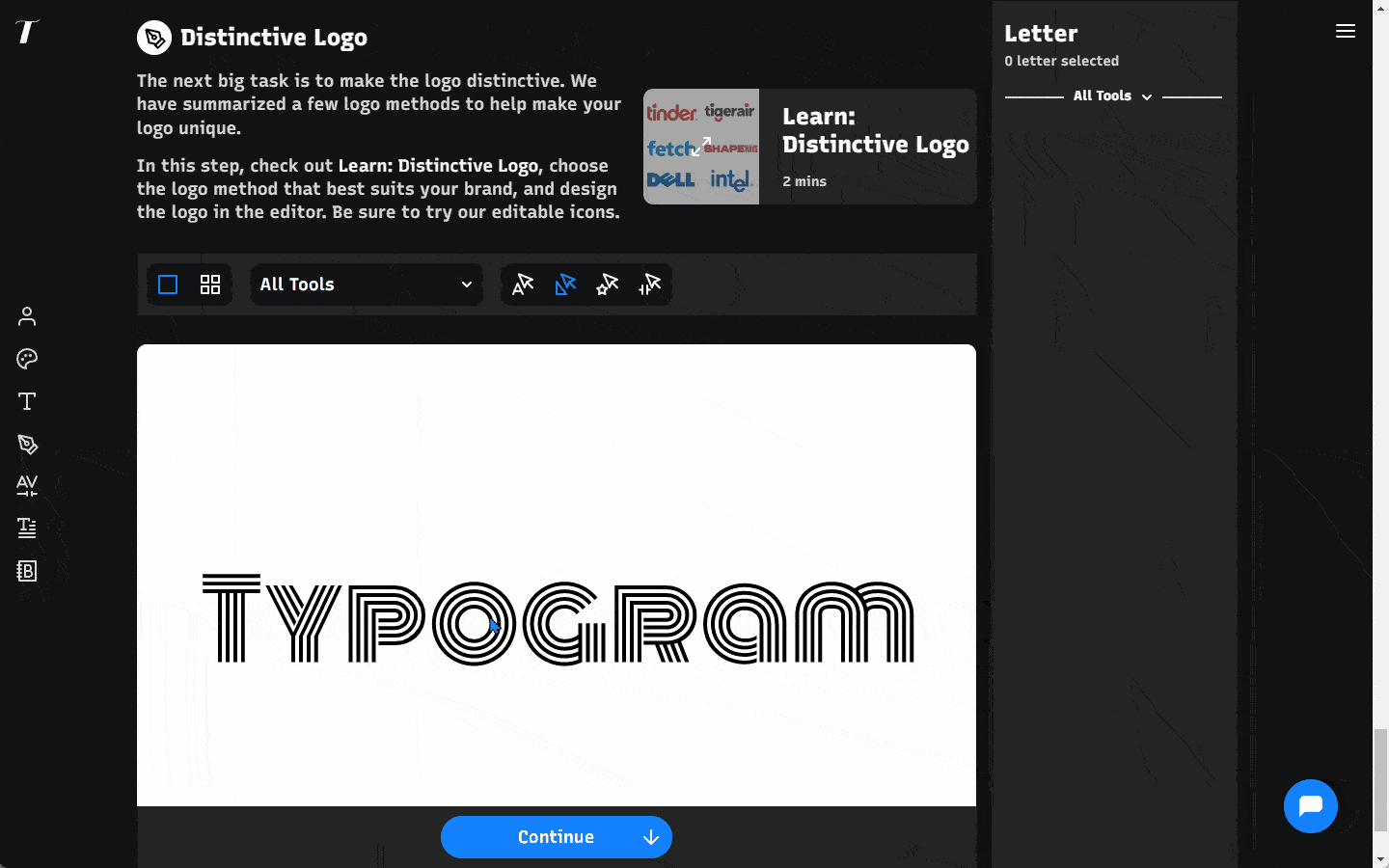
First, a huge announcement: after months of working, we finally launched Typogram!
It's been months of joy and sweat to create this product of love, and now it's finally out in the world. And we cannot wait to get feedback! We are opening up Typogram and allowing everyone to try the features. If you are interested, you can create an account here. I would love to know your thoughts on feedback. It would help us improve our product!
This week, enjoy this post from our archive on my favorite versatile reading font: Spectral.
In This Issue…
Fonts: Spectral
Design idea: Cognitive Bias Directory
Color Inspiration: One More Snow
img: sample of Spectral– Do you have a friend who could profit from the weekly design tips, just like you do? Please consider forwarding or sharing FontDiscovery with your friend by clicking on the button down below.
Font of the Week
About Spectral
Spectral is one of my favorite serif fonts on Google Fonts. It is calligraphic and natural, and it has a slightly more “brushy” look than the serifs we have featured, like EB Garamond and Comourant Garamond. This modern look results from less stroke contrast, which also makes Spectral more favorable for screen reading.
Font Detail
Nine weights in regular and italic styles
Variable version
Large, triangle-like serifs without bracketing
Specific Usage Tips
How to use Spectral for logo?
Due to less contrast in strokes, Spectral has a human touch and a modern tone. Its visual details around the serif (no bracketing) give it an inviting feel without sacrificing the typical elegance and class that come with serifs. Spectral is perfect for a traditional theme project but appears modernized and updated.
How to use Spectral for marketing and branding?
Spectral is great for text-rich screen-based projects such as blogs and ebooks. It can pair with a Slab serif like Zilla Slab or a sans serif like Noto.
Design Idea of the Week
Cognitive Bias Directory
This week I stumbled upon this Wikipedia page about cognitive bias. This page list 188 Wikipedia pages about cognitive biases, grouped into categories, and rendered as a radial diagram. Each list item also links to their corresponding Wikipedia page.
Color Inspiration
One More Snow
Check out this cool-color color theme for your creative projects!
Lake #33AAFF | Steel #738BA3 | Silver Lining #CED8E5 | Noir #383639
Jargon Buster
Line-Height
The space between two baselines of text.
Want more? check out the jargon buster glossary page.
Creative Prompt
Create something with Spectral!
Thank you
…for reading and hanging out here this week! Spectral is available here.