FontDiscovery 🖼️ 106: Just Can't Get Enough: Pixelated Medieval Font!
Hey Everyone👋
Hope you are having a fantastic January so far! This week it's crunch time for us- putting the final touches on the app (walk through if you missed my post last week), updating the homepage with new details about the launch, and building the bug reporting and feedback process, which I manage to make with no code tools.
I can't wait to share more details with you soon! Meanwhile, enjoy this issue from our archive on one of my favorite weird medieval fonts - a pixelated black letter.
In this Issue…
Font of the Week: Heritage Display
Design Idea of the Week: Mascot
Color Inspiration of the Week: Team Lab
Do you have a friend who could profit from the weekly design tips, just like you do? Please consider forwarding or sharing FontDiscovery with your friend by clicking on the button down below.
Font of the Week
Bring Your 'A' Game
Sometimes, the most innovative result comes from combining two drastically different elements. Today we discuss a font that does just that, with calligraphy (Blackletter) and arcade gaming (pixelation).
Looks Familiar?
This iconic, 8-bit graphics screen is synonymous with the beginnings of video gaming. Due to the limitation of the hardware the graphics must take as little computer memory as possible. 8-bit made this possible, and as a result, it created a unique aesthetic that captured this early era.
Font Details
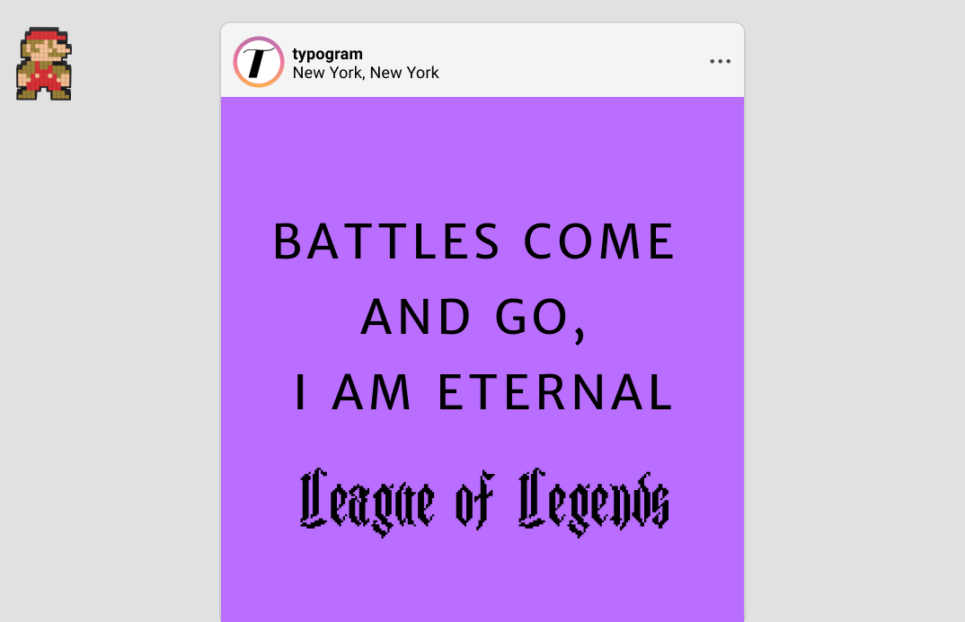
Heritage is two drastically different styles mixed together, Blackletter and pixelation. The shape of the font comes from Blackletter, a style of writing developed from Western Europe in the 11th Century. ( If you want a quick review, check out this issue). The pixelation effect result from the way Heritage Display is created: it is designed on a 25 * 25 grid.

How to use it for logos?
Heritage Display communicates vintage. Being a pixelated blackletter font, it has a unique vibe that is suited for a specific niche. When using, consider if its uniqueness and eccentricity are appropriate or your brand. If your brand has a unique spin on gaming, lifestyle, pop culture, tech, Heritage Display's kookiness can be an eye-catching addition to your graphics.
How to use it for marketing?
You can draw attention to your graphics with an updated color palette to grab attention. Typically, colors associated with pixel fonts and Blackletters are gaming-or medieval-themed palettes. It can be interesting to combine Heritage Display with colors not associated with either of these topics (for example, pastel colors). Heritage Display is not user-friendly for body-size copies and is best for header-size copies. It can pair with Merriweather Sans. It has only one weight.

Design Idea of the Week
Mascot
We connect Mickey Mouse with Disney. We like Nintendo because of Mario. Sometimes it is easier for your audience to connect with your brand or product with a mascot figure. Many different brands like Mcdonald’s, KFC, Microsoft Office have used mascots. It may even boost growth for your product.
Clippy, Microsoft’s controversial mascot; source: Microsoft
Color Inspiration of the Week
Team Lab
Can art ever be more than what's on a white wall? The answer is yes. Team Lab is one of the most famous interactive art collectives in Japan. Team Lab creates large, immersive exhibitions using combinations of lights and interactive technologies. Here you see one of the most well-known exhibitions featuring a pool of intractable koi fishes in the museum. Here is a video.
Creative Prompt
Try drawing a mascot for your project. Grab a pencil and sketch out the first thing that comes to your mind. It can be anything you want, and don't stress about it being perfect.
Thank you!
Thanks for being here for another week. Heritage Display is available here.